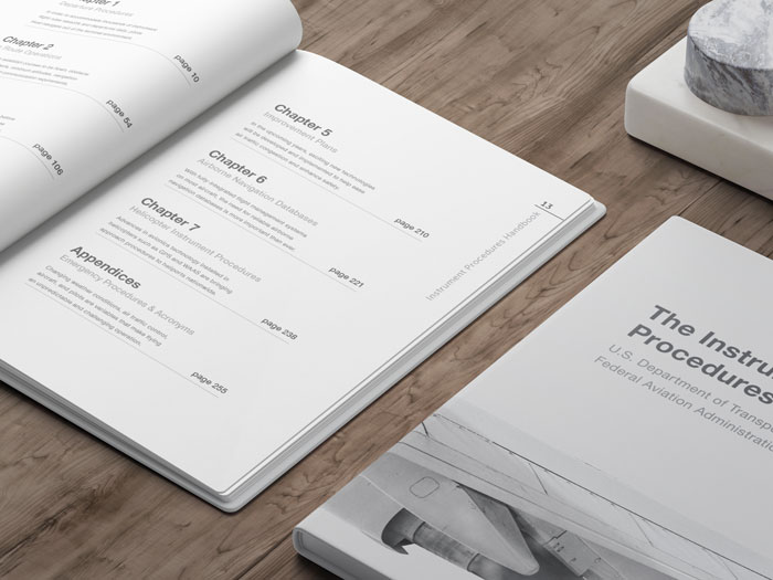
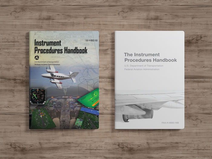
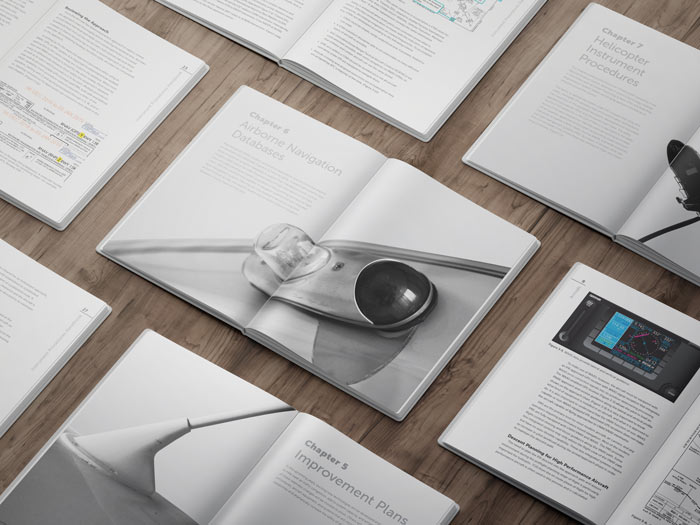
For a typography course, I was tasked with redesigning the cover, table of contents, and a few interior spreads of a book. One of my roommates was in my university’s aviation program, and I had previously flown with him and photographed the preflight process. While doing this, I saw the textbooks used to teach pilots, and I was shocked with how dated the design was.
I thought this contrast was especially striking considering how thoughtful the design of airports are. Travellers are greeted with soaring, open architecture that encourages calm feelings. The textbooks used to train future pilots, however, are crammed with text and have very little breathing room.
In this redesign, I used an entirely neutral palette and crisp shots of aircrafts to start the aesthetic. I added wide margins to the pages and selected Helvetica — commonly used in airports — as the main typeface.
Note: This book is a passion project; while it used content from the FAA, it is not an official FAA document.


