Solution
Campaign Story
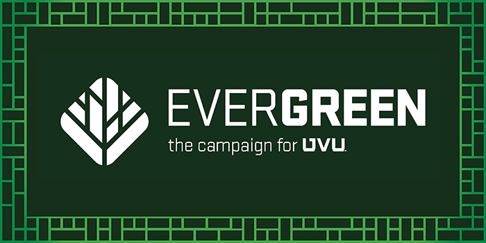
I landed on the name “EverGREEN” because it told several facets of the UVU story. First, evergreen trees are able to withstand harsh conditions due to adaptations that give them the grit and wherewithal to persist. This references the university’s evolution.
Second, “evergreen” is used to describe things that are timeless and consistently relevant. This perfectly describes UVU’s education, where the knowledge and skills attained change lives. By contributing to fundraising initiatives, donors are contributing to the programs, spaces, and scholarships that allow the university to stay relevant in perpetuity.
Third, a quote found within the Roots of Knowledge connected trees to the transformational impact of philanthropy. Often quoted as a Chinese proverb:
“The best time to plant a tree was twenty years ago. The second best time is today.”
Fourth, and most simply, the name stands out because UVU is the only Utah university to use green as its primary color.
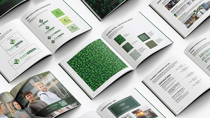
Visual Language
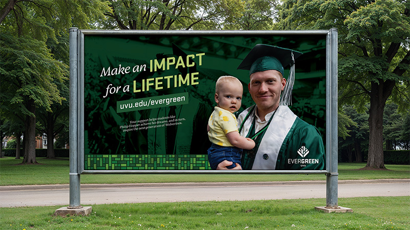
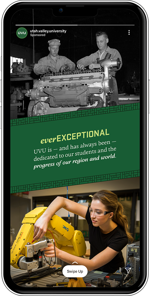
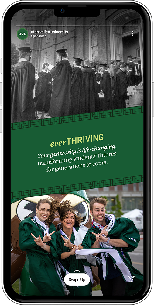
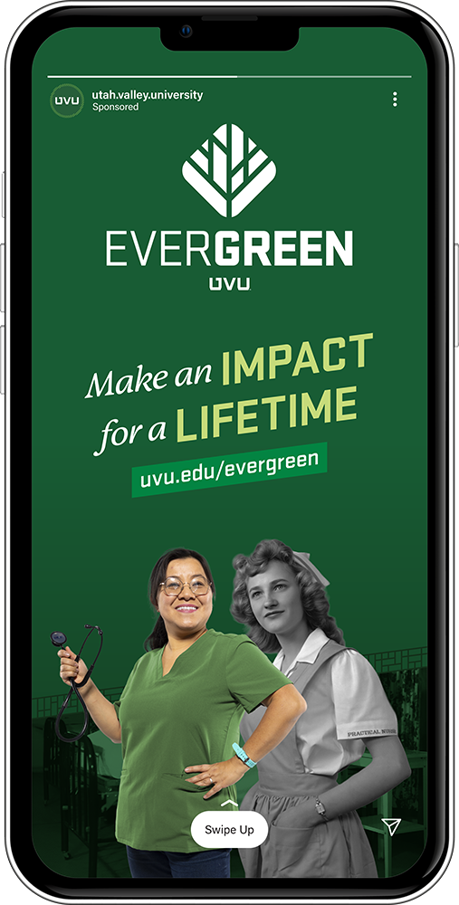
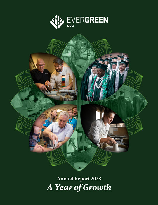
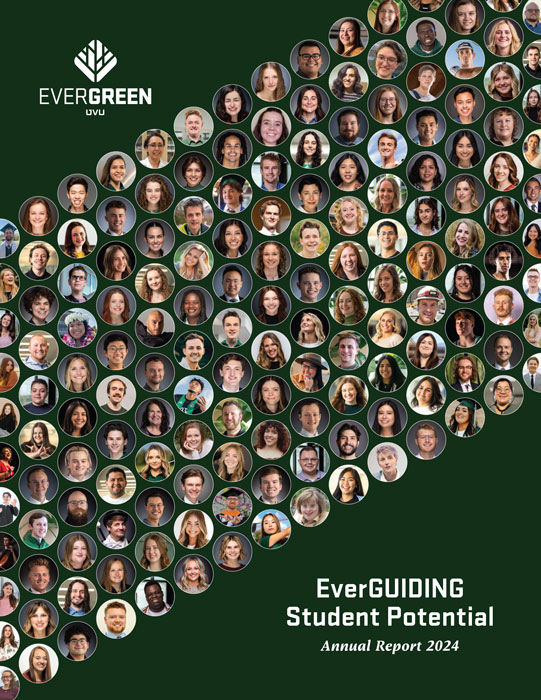
When crafting the visual elements for the campaign, I used an abstracted, modular style. This referenced the buildings of the Orem campus, which are layered due to the former gravel quarry they were built on. The campaign logo was inspired by the simplified tree mark I had pitched, with the final mark being another variation built in collaboration with other campus marketers. The mosaic patterns were modified annually and built upon each other as the campaign progressed.
To provide contrast within the typography, I juxtaposed the university’s industrial typeface with an asymmetrical, storybook font. This created warmth and was distinct from the typefaces in the university’s main branding, providing a distinct feel for campaign assets.
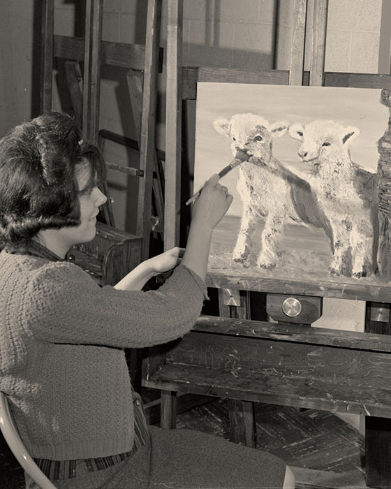
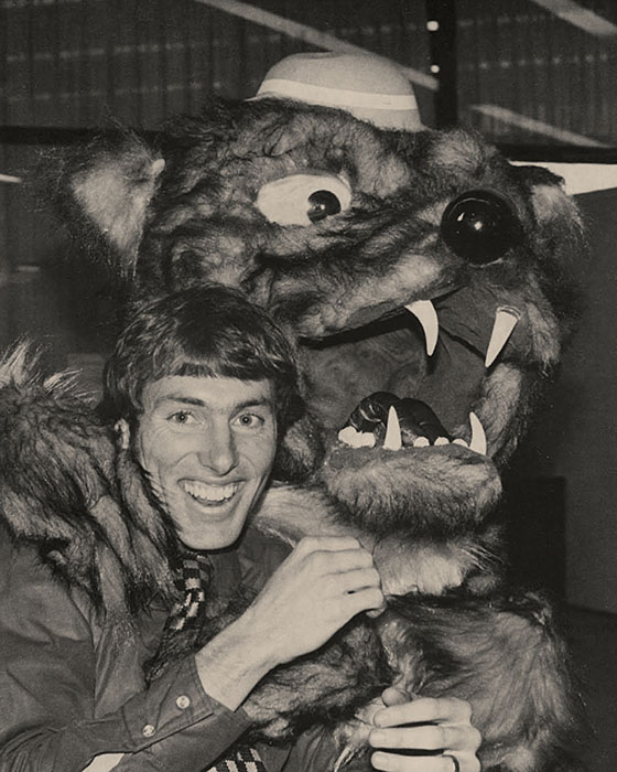
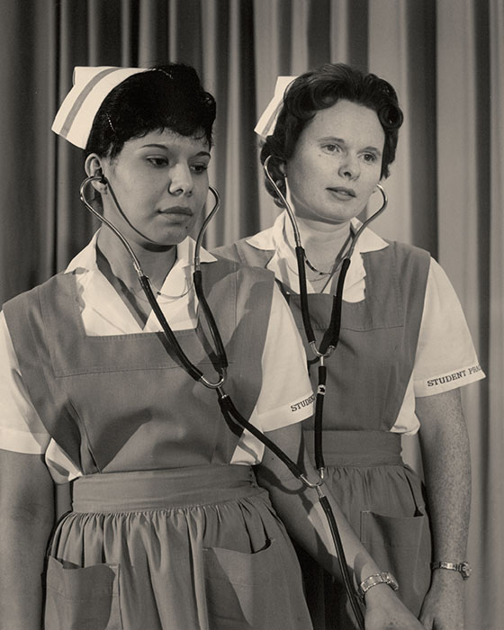
Grayscale and contemporary images were paired to show the evolution of the university. I sorted through thousands of film negatives in the university’s archive to curate the visuals.